
Your bedroom style sets the foundation for all design choices, including your comforter selection. Before purchasing a new comforter, take time to assess your current bedroom aesthetics. Is your space minimalist with clean lines and neutral colours? Or perhaps it leans toward traditional with rich textures and classic patterns? Maybe you've created a cosy cottage-style retreat or a bold contemporary statement.
Identifying your bedroom's style helps narrow down comforter options that will enhance rather than clash with your existing design elements. Look at your furniture, wall colour, artwork, and other textiles in the room. These elements create a visual language that your comforter should speak fluently. As experts at Thingz Gifts suggest, your comforter isn't just a practical item—it's often the largest visual element on your bed and can either tie your design together or create jarring discord.
How to Choose a Comforter That Complements Your Bedroom Design
May 11
Selecting the Right Size and Weight
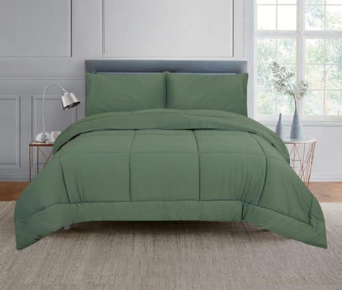
Size matters significantly when choosing a comforter that complements your bedroom design. A comforter that's too small looks awkward and fails to create the luxurious, inviting atmosphere most people want. For queen and king beds, consider oversized comforters that drape beautifully over the sides, creating a hotel-like elegance. For single beds, ensure the comforter covers the mattress with a reasonable overhang without overwhelming the space.
Weight is another important consideration that affects both function and appearance. Comforter weight impacts how it drapes on your bed, which changes its visual impact. Lightweight comforters create a sleeker, more tailored look, while heavier options offer more volume and dimension. Your climate plays a role too—lightweight options work better in warmer regions, while colder areas benefit from heavier fills that provide insulation and create a visually substantial bed centrepiece. The right weight ensures your comforter hangs appropriately on your bed, contributing to the overall design harmony.
Colour Psychology and Coordination
Colour choice dramatically impacts your bedroom's atmosphere and should align with your design goals. Blues and greens promote calmness and relaxation—perfect for creating a serene sleep sanctuary. Warm tones like terracotta, gold, or soft coral add cosiness and comfort. Neutrals offer exceptional versatility, allowing you to change other bedroom accessories seasonally without clashing.
When selecting your comforter colour, consider "the 60-30-10 rule" used by interior designers. This approach suggests using a primary colour for 60% of the room (often walls), a secondary colour for 30% (typically large furniture pieces or flooring), and an accent colour for 10% (accessories). Your comforter can fit into either the 30% or 60% category, depending on your room's existing colour distribution. Remember to factor in your wall colour, carpet or flooring, furniture finishes, and existing textiles when choosing your comforter colour to ensure visual harmony rather than competition between elements.
Pattern and Texture Considerations
Patterns and textures add depth and interest to your bedroom design. When selecting a comforter, consider how its surface details will interact with other elements in your space. In minimalist or already busy rooms, a solid-coloured comforter with subtle texture often works best, providing visual rest while still offering tactile interest. In simpler spaces, bold patterns on your comforter can serve as a striking focal point.
Texture creates visual weight and dimension even without patterns. A quilted comforter adds structured elegance, while ruched or pleated styles bring soft sophistication. Consider how light plays across different textures throughout the day—some textures catch light dramatically while others create a more subtle effect as lighting changes. This interplay between light and texture affects your room's ambiance throughout different times of day. The right texture choice depends on your overall design goals: smooth for modern spaces, nubby for casual comfort, or silky for luxurious elegance.
Layering and Accessorising Your Comforter
The art of layering transforms an ordinary comforter into a design statement. Start with a quality comforter that complements your room's colour scheme and style, then build upon this foundation. Add Euro shams at the back, standard or king pillows in coordinating cases, then decorative cushions in complementary colours or patterns. This creates depth and invitation while showcasing your personal style.
Don't overlook the power of throws as finishing touches. A carefully draped throw blanket at the foot of your bed adds texture, colour contrast, and practical warmth. Choose materials that contrast with your comforter—a chunky knit throw with a smooth comforter or a silky throw with a textured comforter creates visual interest through opposition. Consider seasonal adjustments too. Lighter throws for summer and heavier, more substantial options for winter keep your bedroom design fresh while maintaining its core aesthetic. These thoughtful layers transform a simple bed covering into a cohesive design element that elevates your entire bedroom's appeal.